

Commentary
One in four professional-class workers has not had a raise in five years. This is according to a new study by the Burning Glass Institute, which conducted the study with New York University’s School of Professional Studies. They have hit a wall in terms of pay. Those in this group know this. They hang on to their jobs in this no-hire/no-fire economy.
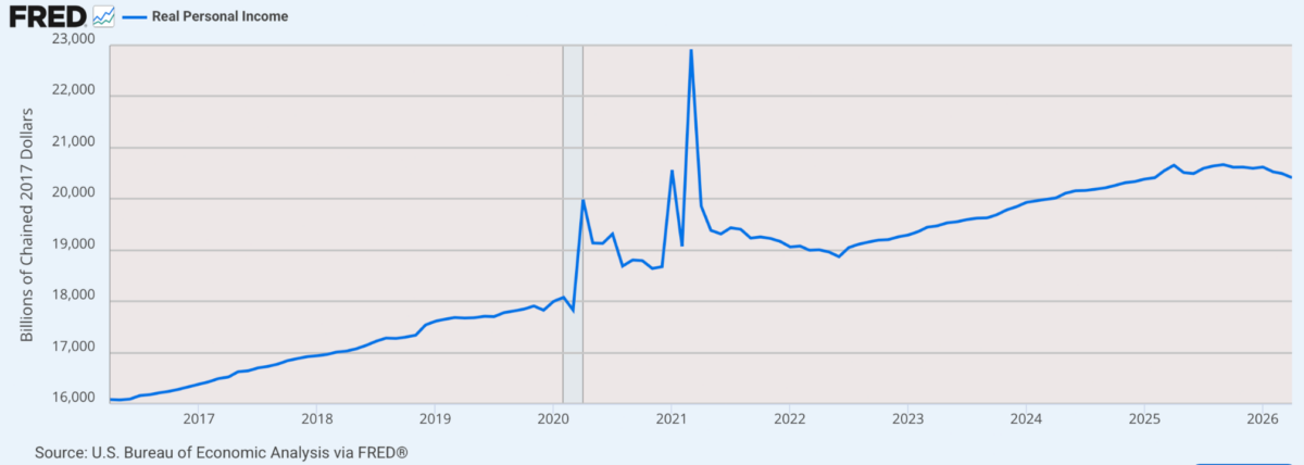
Think about the implications in light of inflation, which has melted away 25 percent to 30 percent of purchasing power over five years, according to official data. It means that not only have these workers not received a raise, but that, in real terms, their pay has been cut by a quarter to a third of what it was.
Now, how can we make sense of this in light of the frequent claims that real income per capita is rising? These claims are based on aggregate workers from all sectors. Once you drill down to isolate the professional class, matters change dramatically.
For years, I’ve genuinely wondered about the credibility of all government data. There are just too many anomalies, adjustments, reporting gaps, and statistical credibility issues at play. Put them all together, and the economic picture, as painted by official data, gets gauzy.
Two years ago, Brownstone Institute commissioned E.J. Antoni and Peter St. Onge to do a study that made some intuitive adjustments in the pricing indexes to assess where we are in the business cycle. Their assumptions were extremely conservative. They concluded that we’ve been in recession since 2022.
The study came under heavy attack by writers who can bear no criticism of official data. I understand why. Gross domestic product (GDP) and consumer price index (CPI) are nearly doctrinal for most economists. If the official numbers are not credible, they lose a major tool of understanding and professional credibility. So the study we published did not make a dent in the public mind, even though I was darn sure that it was correct.
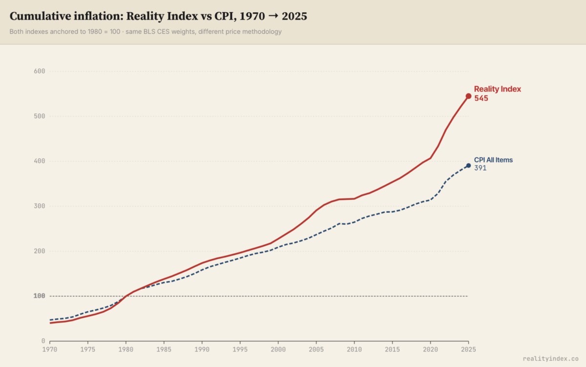
Now we have a new voice added to the mix. He is Tom Elliott, an American programmer living in Spain. He used artificial intelligence to do some heavy lifting on basic pricing data. He has posted the results on RealityIndex.co. His data reaches back to 1970 and deals with actual prices without adjustments made for quality and other factors that have made a mess of regular CPI data.
He concluded that the dollar has lost far more purchasing power than is officially reported. The divergence has become especially intense since 2020, when the economy went into a deep recession followed by devastating inflation that briefly reached double digits.
Elliott explained his methodology in The Wall Street Journal:
“The CPI measures the price of a basket of goods after a series of technical adjustments. When something gets more expensive, the formula assumes you switch to a cheaper substitute, and it counts the substitute. When a product improves—a faster phone at the same price—the formula treats the improvement as if it were a price cut, even though your bill didn’t fall. For housing, it doesn’t use home prices at all; it uses an estimate of what homeowners would hypothetically pay to rent their own homes. Each adjustment has a respectable academic rationale. And each one, in practice, has pushed the reported number down rather than up. Stack those adjustments up, year after year, and they compound into a sizable gap between the inflation the government publishes and the inflation families actually live.”
It’s interesting because, as I’ve detailed in The Epoch Times, there have been approximately eight major changes to the CPI over the decades. They affect every single sector.
Consider just since 2000.
“That same basket, the one the government says rose 1.87 times since 2000, has actually risen about 2.4 times,” Elliot said. “In plain terms, the life that the official figure says should cost $187 today really costs around $240—a difference that the headline number never shows you. It’s why the raise that was supposed to keep you even somehow didn’t. It’s the distance between the report on the news and the receipt in your hand.”
Isolating from the beginning of the COVID-19 period to the present, Elliott’s data estimate as much as a 40 percent loss in purchasing power over six years. This seems correct to me. Government data, meanwhile, log only a 26 percent loss. That’s a massive gap.
All of this is fascinating and probably not new to you. You know it every time you go to the grocery store. What used to be expensive now seems cheap compared to what you saw at the other store. A $15 steak is a relief to us, whereas it was only recently $10. Gas is up and up. Housing is out of control. Healthcare costs are chaotic, as are the premiums for medical insurance. Everything is sky-high. Once you add in side charges and fees, plus weird premiums for every bit of special service, your own personal inflation rate is far higher than the CPI would indicate.
So we should be grateful to Elliott for having done the math here.
There are still larger implications. We measure national output with GDP, a national income statistic used since the 1930s. For output data, it would make no sense to report it in nominal terms without factoring in inflation. As a result, GDP is usually reported in real terms, with an inflation adjustment that is continually compounded on an annual basis.
Elliott’s own data did not go into the implications for GDP. But I was able to use a simple AI tool to make those adjustments myself. The result is rather astounding. The recession of 2020 never really ended in a sustained way. Charted by hard numbers and then by percent change, you gain a very different picture of present levels of output. It causes one to completely rethink the past six years.
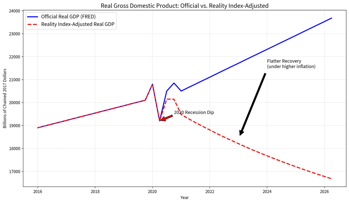
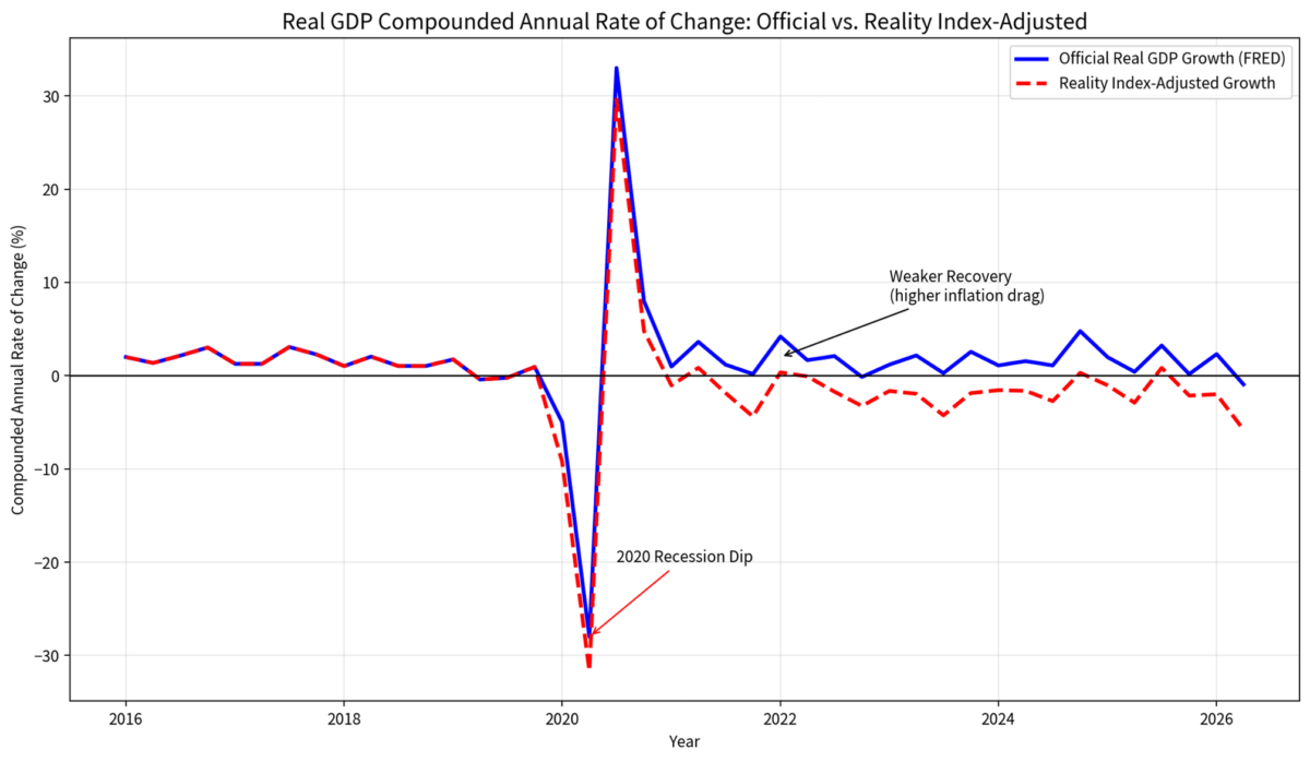
Overall, Grok AI estimates a loss of 5 percent to 12 percent of GDP from 2019 using Reality Index numbers. Sorry, but read that again. Instead of any recovery, we’ve seen as much as double-digit declines in GDP since 2020.
That’s roughly half of the Great Depression, which was more catastrophic than people know. Most research from the period, by George Selgin, for example, shows that this period of the 1930s was not a normal business cycle but a structural hit tracing to the very measures designed to fix the problem. Price controls and market disruptions made a bad situation far worse. This is precisely the sort of hit that should worry us the most.
At least during the Great Depression, people knew it was happening. It was officially documented. Our times are different. We have heard nothing for six years except happy talk about economic recovery. Based on real data, the opposite has happened, most tracing to the disastrous lockdowns of 2020.
The beauty of this data is that it is subject to replication. Anyone can look at the methodology and disagree. Be my guest. From what I can see, the actual picture is far closer to the reality that most people are experiencing.
In other words, that only one in four workers has had a nominal raise in five years barely scratches the surface. The reality could be that we’ve lost as much as 12 percent of national output since the lockdown period. It’s somehow worse that we are only now able to document this.
Views expressed in this article are the opinions of the author and do not necessarily reflect the views of The Epoch Times.
 Friends Read Free
Copy
Facebook
Tweet
Friends Read Free
Copy
Facebook
Tweet