

Commentary
For a very long time, I’ve wondered about the legitimacy of inflation data. I’m hardly alone. The academic literature is filled with questions. The answers mattered less when inflation was a predictable 2 percent and most people sensed that the problem had been conquered for good. The gradual loss of purchasing power was annoying but not devastating.
That changed in 2021 when the dramatic quantitative easing from COVID-19 pandemic spending bled straight out into the streets. Inflation raged. You could feel it every time you went to the store, shopped for a car, looked at house prices, or paid your medical bills. We got a respite from the extreme version in 2025, but it is vexing us again in both consumer and producer prices.
The consumer price index (CPI) just posted a 3.8 percent rise while the producer price index (PPI) is running at 6 percent. These are very bad numbers by any historical standard. Meanwhile, the rising price of gas alone threatens real political consequences. This topic has become very real, very fast.
All this time, one has wondered whether and to what extent the data is being accurately measured. We’ve known about the adjustments that the Department of Labor makes to housing prices. They are not measured directly but rather converted to owners’ equivalent rent. Medical service prices are adjusted for consumption. When consumers substitute one good for another, that is also factored in. When the quality of a good or service improves, the statisticians apply what they called hedonic adjustments.
Where does this leave those of us who are looking for a plain index of prices? A veil has been put over that basic question and answer, such that we don’t know for sure. This matters tremendously for issues such as raises, examining cost of living increases, taxes, and pension payments. Everything is adjusted for inflation to convert it to real valuations, but if we don’t have a clear number, what are we to do?
This is why I’m thrilled to tell you about a new service called the Reality Index. You are free to browse the site yourself and examine every aspect of the method. Essentially, the site owner, an independent intellectual in Madrid—Tom Elliot—has deployed tools of AI to wholly reconstruct price indexes in a way that is consistent with actual prices. His results are absolutely eye-popping. I’ve examined the method here in detail and found no fault.
Here is the core of the problem: a constantly changing methodology in official data. The formula was changed eight times over 35 years. All of the changes seem technical and vaguely justifiable, once explained. Adding them all up, you get wild distortions in the data that the index is supposed to reveal.
In 1983, owners’ equivalent rent replaced basic housing prices. The new formula was based on an estimate of what homeowners would have to pay to rent their own homes. But in real life, people pay mortgages, property taxes, and home prices. When home prices and mortgage rates rise faster than rents, the new formula understates the housing inflation real households face.
In 1996, the Boskin Commission announced that CPI was overstated because people substitute higher-priced goods for lower-priced goods which are too slow in being calculated. The agency made the correction to eliminate the bias in the fixed basket of goods. The problem is that every single adjustment ended up forcing the reported rate to be less than a plain addition of the same goods over time.
In 1998, there was a new fashion for hedonic adjustments. This stemmed from an observation that quality is always improving, especially in digital goods and computer functioning. The idea is that you might be paying the same or even more but you are getting more bang for your buck with quality shifts. You guessed it: Hedonic adjustments drew the inflation rate lower. Notably, hedonic adjustments never run the other way, raising prices when quality decreases.
In 1999, a geometric mean formula replaced arithmetic mean for most CPI components. This was intended to capture substitution effects. This was the change that ended up disguising the increase in medical service costs. By looking at consumed services rather than actual prices, the inflation rate in this sector ended up burying inflationary trends. This highly technical adjustment completely ignored all the ways in which substitution is a behavioral adaptation to inflation, not a reduction in the inflation experienced.
In 2002, we got a continuation of this same method with new “chained CPI,” which changes the basket weighting based on new purchasing patterns. Sure, if people buy less beef and more chicken, the household will experience inflation in a different way. But this ignores the manner in which the substitutions themselves are a response to higher prices. In 2017, the new calculation was applied to taxes causing people to pay more than they otherwise would have under the old method.
In 2018, the hedonic adjustment strategy was expanded to a huge new range of products including smartphones, residential telephone services, internet services, and cable and satellite television.
Finally, in 2024, the Bureau of Labor Statistics stopped looking at the actual cost of medical services and started looking only at claims, completing the consumption-only bias against actual posted prices.
So what happens when we strip all this away and examine actual prices as reported by the Bureau of Labor Statistics, without all of the many adjustments? We find that a basket of goods and services that cost $100 in 1980 costs $515 per the Reality Index in 2025. The official CPI reports only $391.
That means that real prices have run 32 percent higher over 45 years than the government reports. Over a 55-year window, the Reality Index ran 54.4 percent faster than CPI.
To put it another way, consider the loss of purchasing power since 1980. According to the CPI, the loss has been to make $1 in 1980 worth only 26 cents. According to the Reality Index, the loss is greater: $1 in 1980 is now worth only 19 cents. By any standard, that is a shocking devaluation.
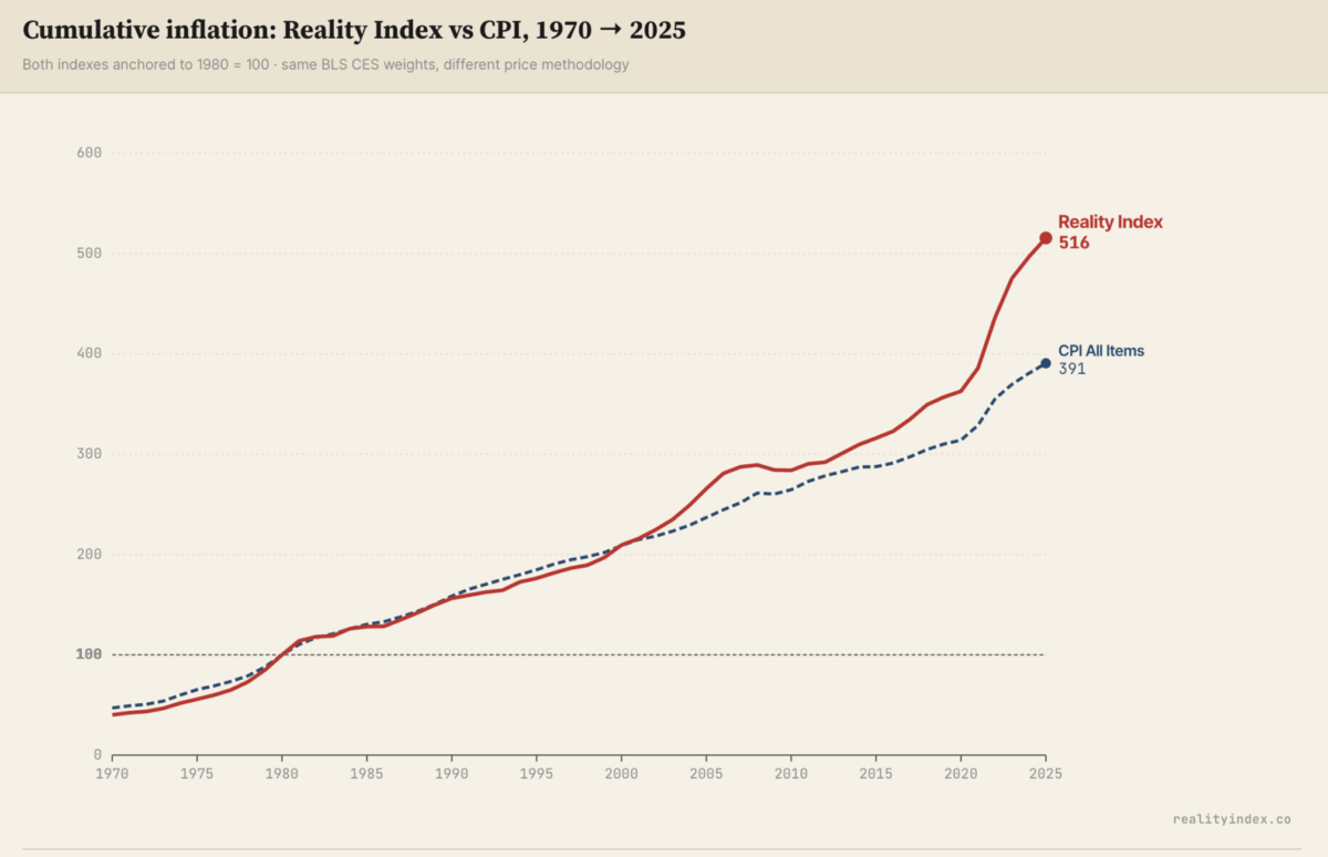
You can observe how the gap between the CPI and the Reality Index increases as more and more data manipulations are added by the Department of Labor for its final print of the CPI. These days this gap is larger than ever.
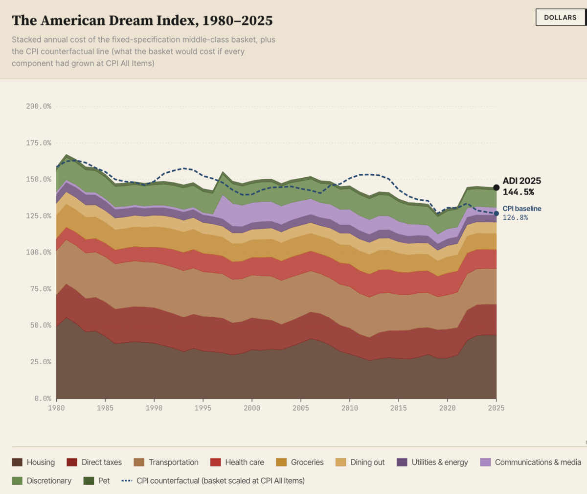
In a second large product, the statistician decided to examine what he calls the American Dream Index. This consists of a look at what it costs to have a middle-class lifestyle in 1980—a four-bedroom home, three children, two cars, one dog, employer health coverage, and modest discretionary spending. He sought this price and affordability by income annually from 1980 to 2025.
The results: The American Dream cost 159 percent of median household income in 1980, and 145 percent in 2025. “The middle-class American life that 1980 promised has been priced beyond the median family’s reach for at least 45 years—and that gap has not closed. … The dollar cost grew [by] 5.16 [times] in nominal terms [from 1980 to 2025], while median household income grew [by] 4.89 [times]. The aggregate ratio improved slightly, but the composition shifted hard: health care grew [by] 7.5 [times] (about double CPI All Items), the housing carrying cost grew [by] 4.2 [times], and groceries grew [by] 3.3 [times]. Families have less room to cut and more costs coming from things they can’t escape.”
In short, what we find here is confirmation of what many have suspected. There has been no real improvement in the household experience of the American Dream in nearly half a century, a shocking conclusion for those who are looking only at household income adjusted by CPI conventions.
There is much more work to do with this method. The charts could be interactive. They can also be set for real-time updates. They will be if Elliot continues to develop this. He should. There might even be commercial value in this.
Also, I would like to see his methods applied to my own concern over effective household income per hour of work. We keep hearing that household income is rising in real terms without considering that it takes two incomes to provide what one once did. It won’t do to pretend that two incomes in a single household is double the income when one person has been drafted into the workforce to sustain living standards.
Adding that consideration in here, and the dramatic change in household remuneration between 1950 and 1990, would be very revealing. After all, one in five households (with children younger than 18) had two income streams in 1950; it is three in five today. That is effectively a diminution of wages per household hour and not an increase in income. Add that consideration and you would generate a chart of declining living standards.
In any case, it is long past time for this technical work to be done. What this site has provided is what index numbers should provide: clean and stable comparisons of the same or similar products over time, no adjustments, refinements, and manipulations.
We’ve lived so long with distorted statistics. It fascinates me that the person who finally did it is an independent data expert in Spain rather than an employed academic in the United States. That itself is revealing.
Views expressed in this article are the opinions of the author and do not necessarily reflect the views of The Epoch Times.
 Friends Read Free
Copy
Facebook
Tweet
Friends Read Free
Copy
Facebook
Tweet